Redesigning Reddit without redesigning what makes Reddit, Reddit.
AT A GLANCE.
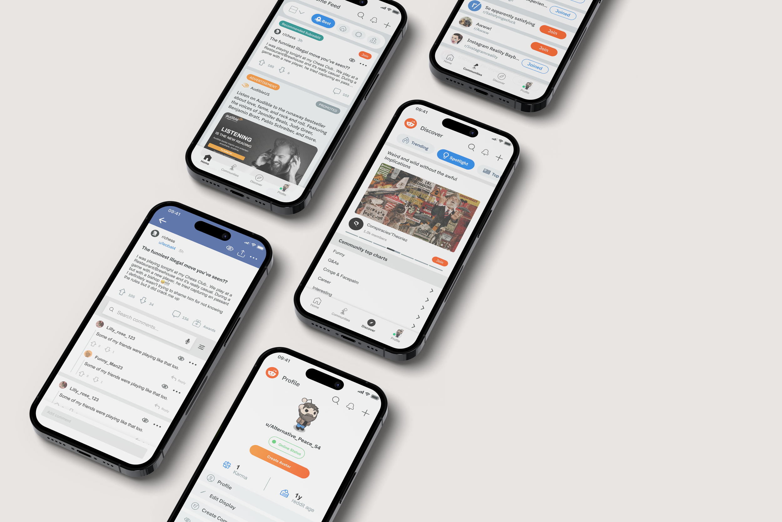
In a five-day design sprint, I teamed up with two other designers to rethink the Reddit mobile experience—improving navigation, accessibility, and interaction while preserving the features and visual characteristics that made the platform instantly recognizable.
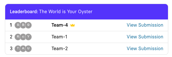
350+ designers. 5 days. 1 winning team.
Role
UX/UI Designer · Product Designer
Scope
UX Research · Information Architecture · Wireframing · UI Design · Accessibility · Prototyping
Deliverables
User Research · Wireframes · UI Mockups · Interactive Prototype · Before & After Screens
Know more
-
How do you improve Reddit without losing Reddit?
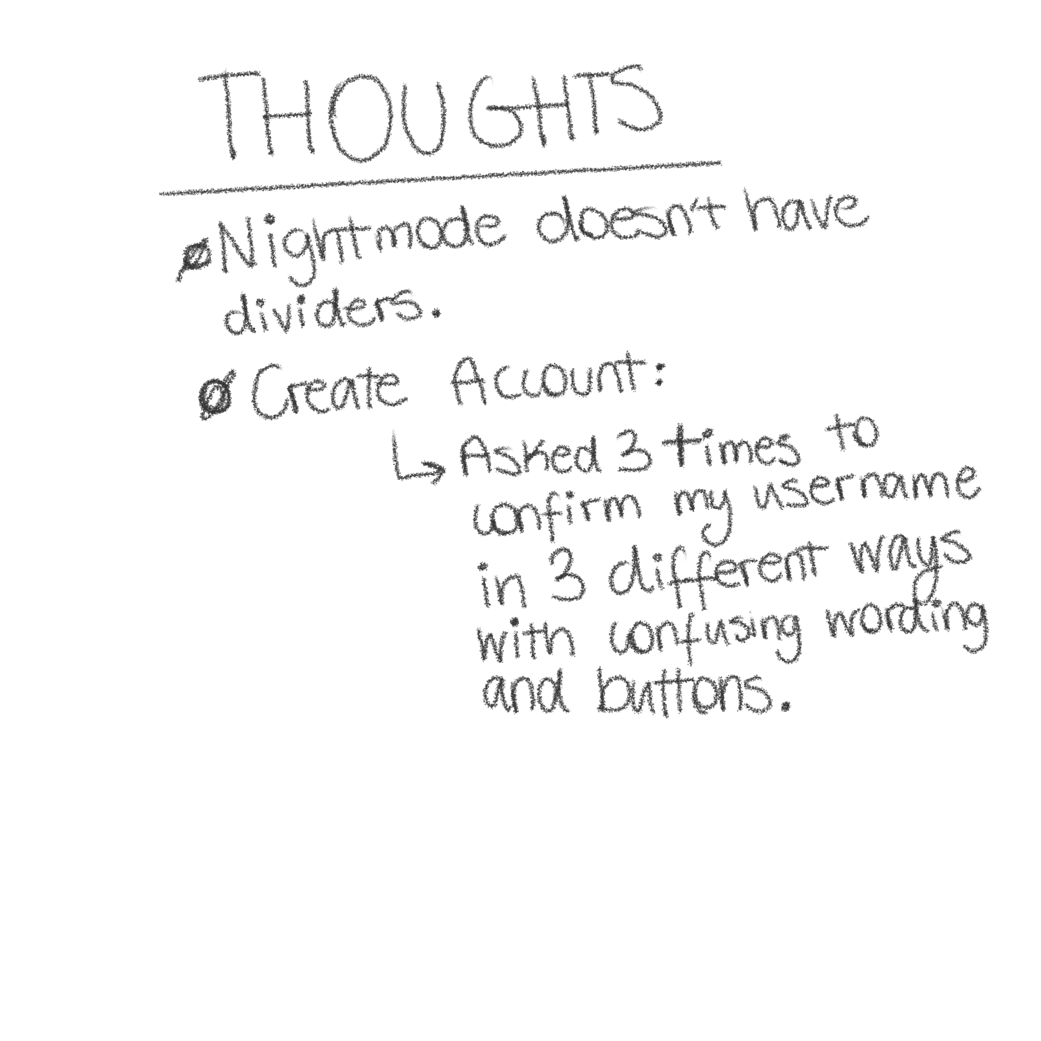
Reddit's interface has become familiar to millions of users—but familiarity doesn't always mean usability. We identified several friction points throughout the experience, including a sluggish-feeling interface, difficult-to-find controls, repetitive and concealed UI elements, and limited customization options.
Accessibility was another major concern. Users who needed to adjust elements such as font size had few ways to adapt the experience to their needs. Our challenge was to improve the experience without stripping away the characteristics users already associated with Reddit.
The goal wasn't to reinvent Reddit. It was to make the Reddit people already knew easier to use.
-
Start with the friction.
We looked at where users were getting frustrated and what was making everyday interactions harder than they needed to be.
The biggest opportunities centered around:
Navigation. Important actions and destinations weren't always easy to find.
Clarity. Hidden and repetitive interface elements created unnecessary cognitive load.
Accessibility. Limited customization made it harder for users with different needs to adapt the experience.
Personalization. Users had limited control over how content and threads appeared in their feed.
These insights became the foundation for our redesign.
-
Familiar, but easier.
Because Reddit has such a recognizable visual language, we didn't want to create an entirely new interface just for the sake of making it look different.
Instead, we focused on reorganizing what was already there.
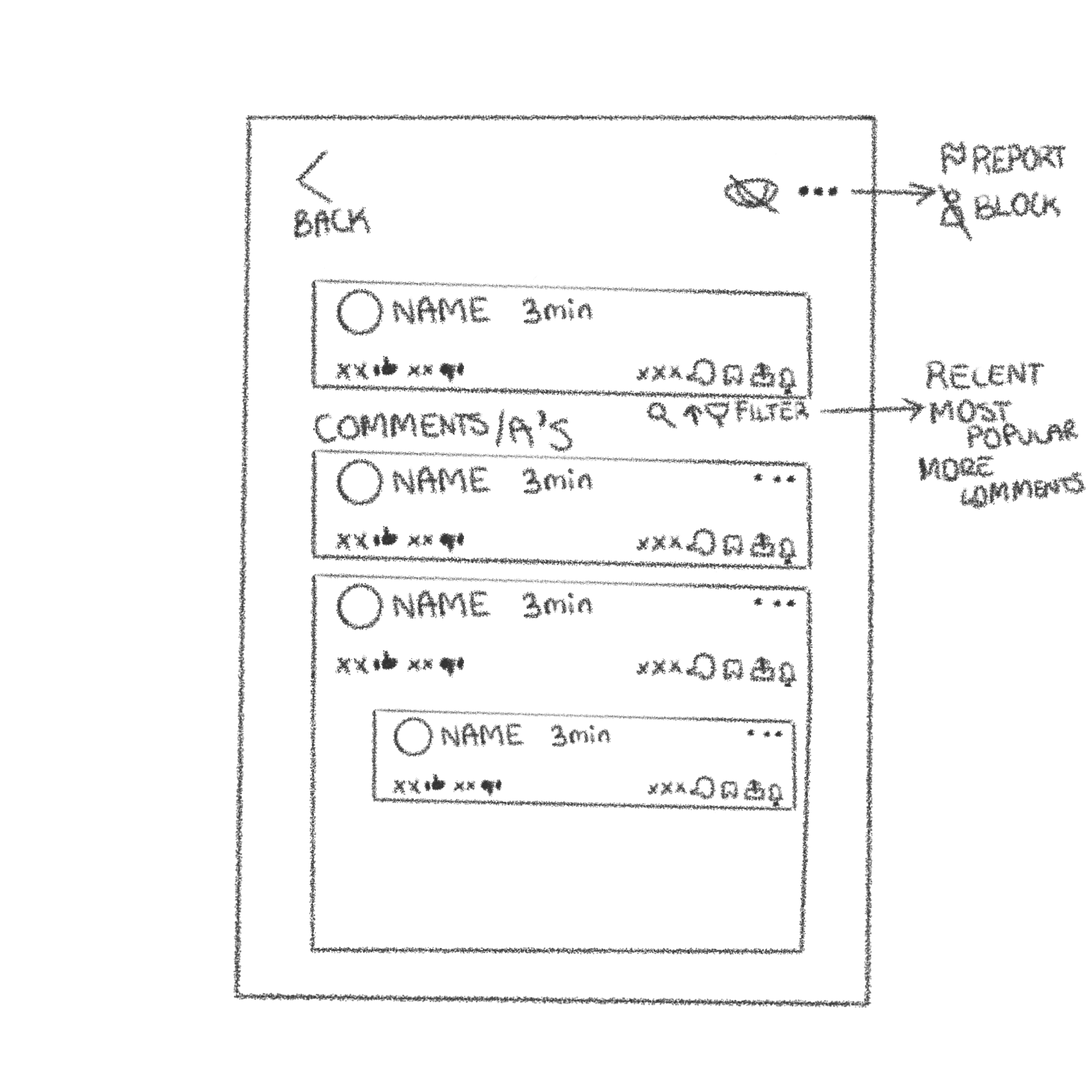
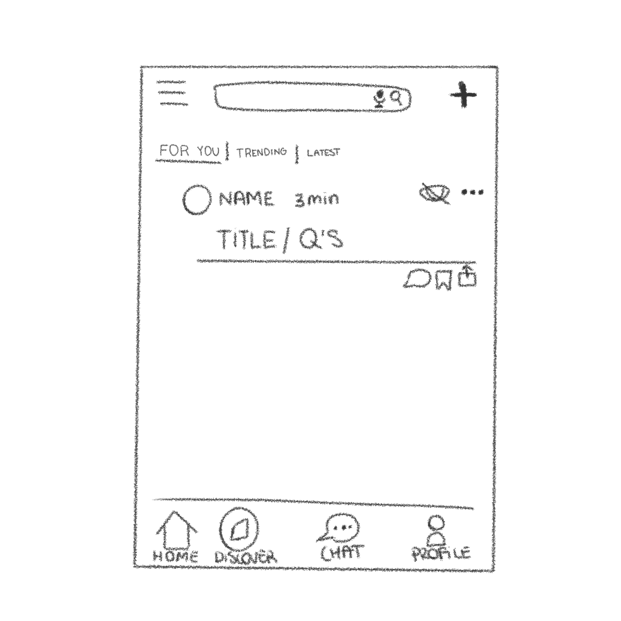
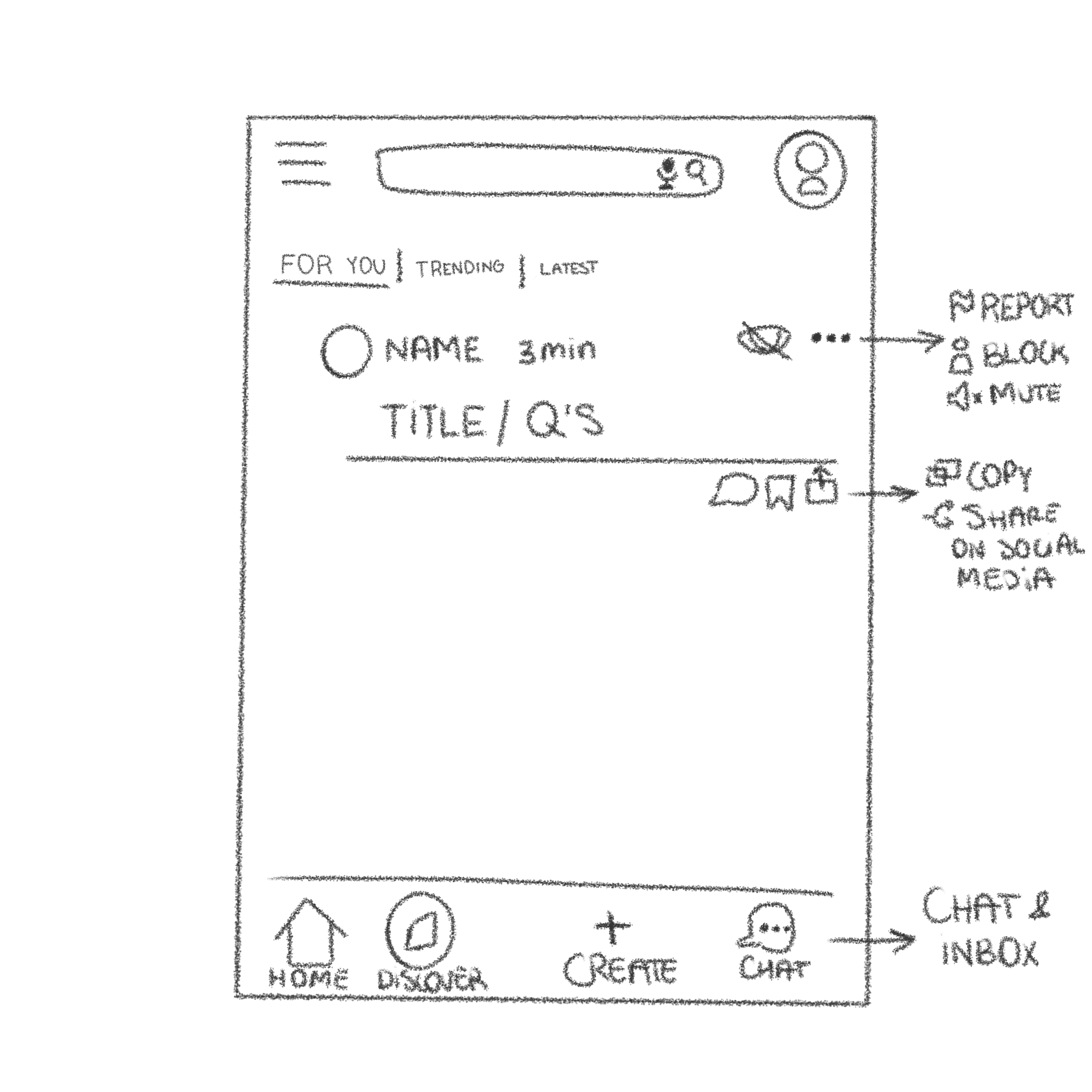
We created quick sketches and wireframes for the homepage and thread experience, using them to test how information could be prioritized before moving into the final UI.
Our design decisions centered around three principles:
Clarify. Make information and actions easier to find.
Simplify. Remove unnecessary friction without removing useful functionality.
Personalize. Give users more control over how they experience their feed.
The Redesign
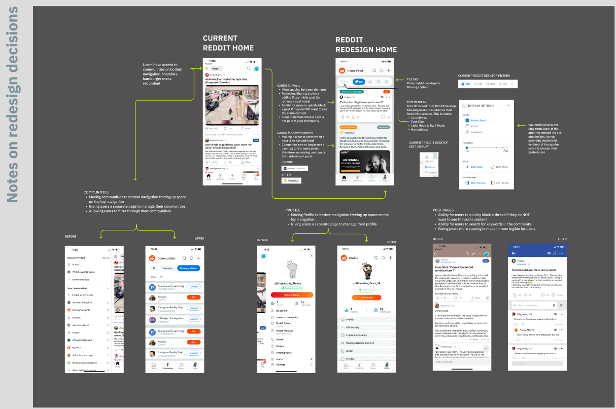
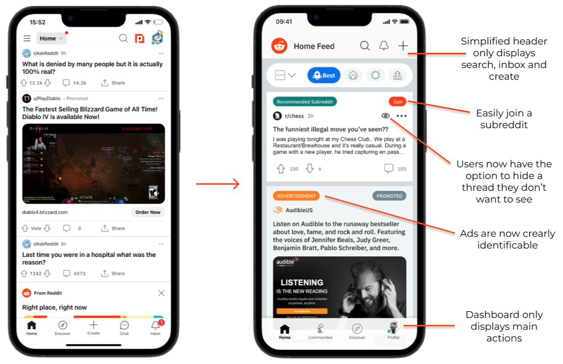
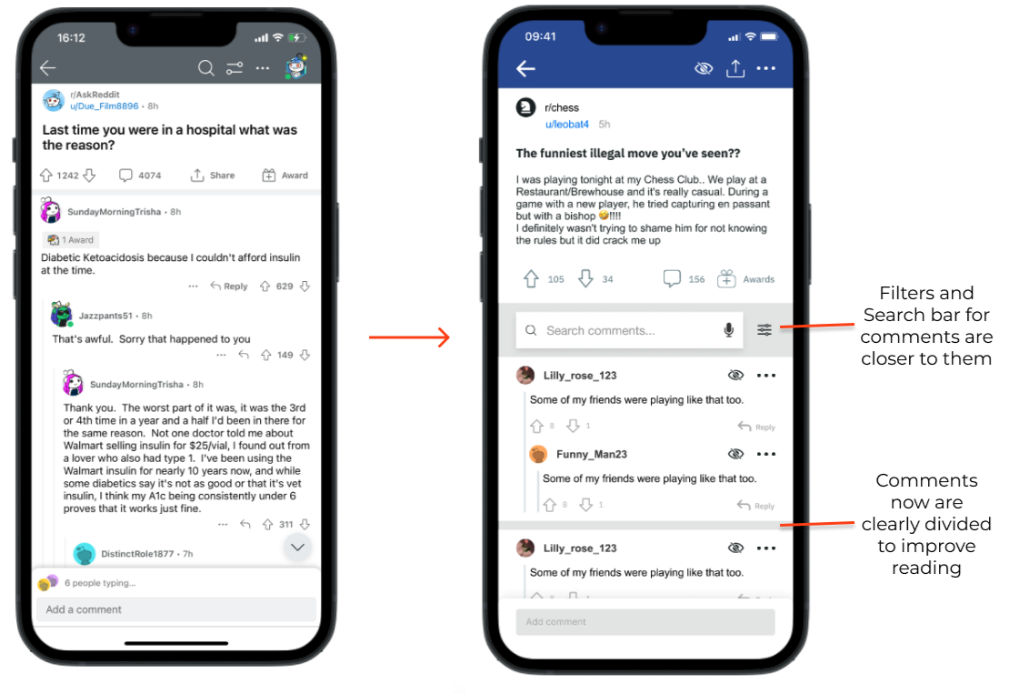
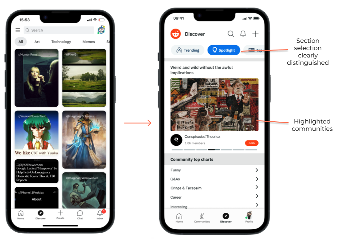
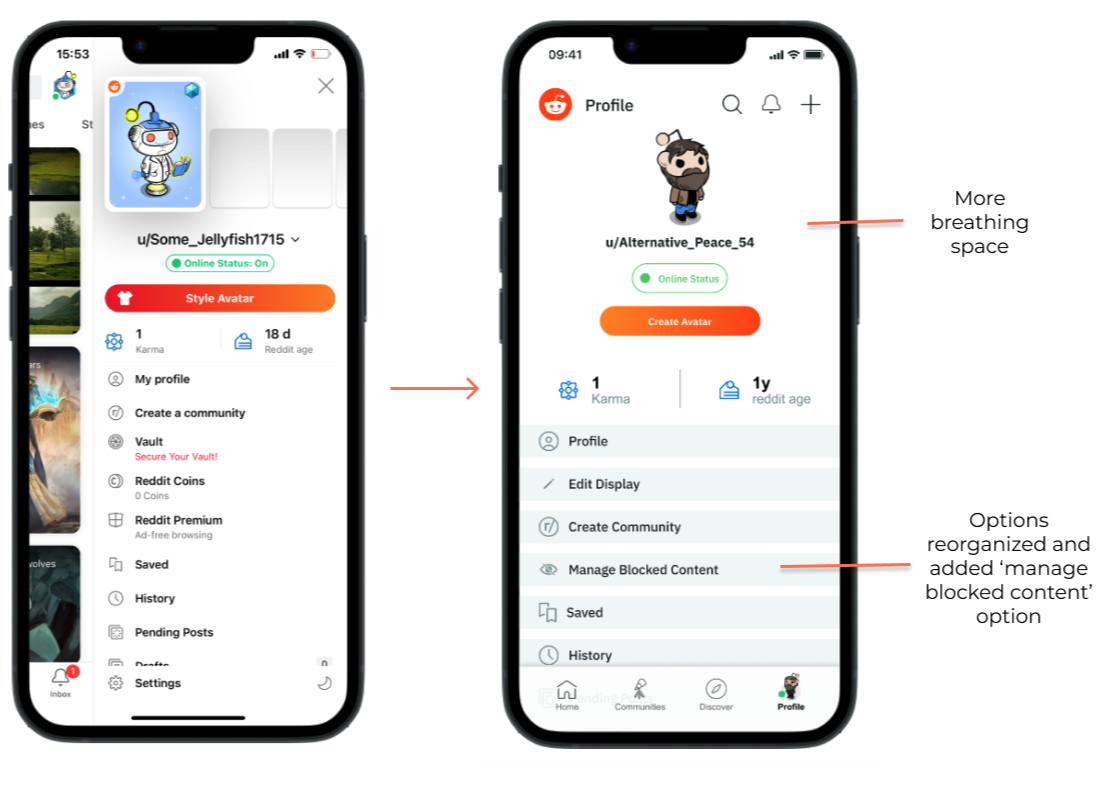
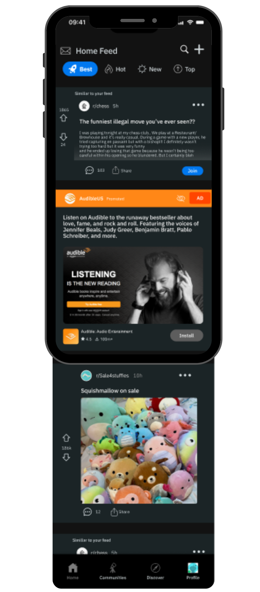
We redesigned the home feed and navigation to create a clearer visual hierarchy and give content more room to breathe.
Different types of communities and threads were more clearly labeled, helping users understand what they were looking at without having to decode the interface.
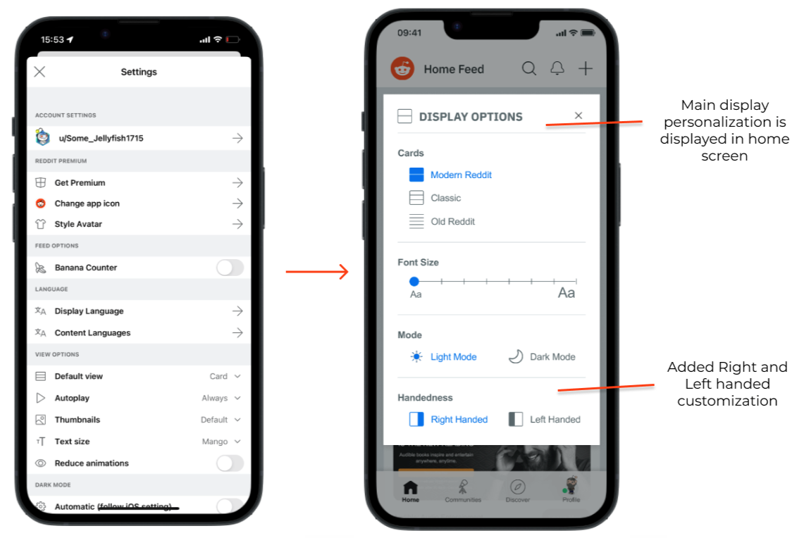
We also brought key personalization options closer to the surface, making them accessible in a single tap instead of hiding them behind multiple interactions.
And because not every thread deserves your attention, we introduced the ability to silence or hide a thread directly from the feed.
Small changes, but ones designed around the way people actually use the app.
More breathing room. Less searching.
An experience that adapts to the user.
Accessibility wasn't treated as an additional feature—it was part of the redesign from the beginning.
We looked at how typography, spacing, hierarchy, and customization could make the interface easier to read, understand, and interact with for a wider range of users.
The goal was simple: The interface should adapt to people, not the other way around.
-
Five days. Three designers. One very tight deadline.
This project was part of Sprintfolio, a series of rapid design challenges created to push designers to develop and communicate solutions under tight deadlines.
Working with two designers remotely meant we had to move quickly, communicate clearly, divide responsibilities, and make decisions without getting stuck in endless iterations.
There was no time to perfect every detail. We had to identify the most important problems, agree on a direction, and execute it. That constraint became part of the value of the project: learning when to explore, when to decide, and when to let an idea go.
A winning solution without losing the original soul.
Our team won the Reddit redesign challenge among 350+ participating designers.
But the award wasn't the part of the project I valued most. What stayed with me was seeing how three designers, working remotely and under a five-day deadline, could bring different perspectives together and turn them into one cohesive product experience.
The final concept demonstrated that improving usability doesn't always require starting over. Sometimes, the best redesign is the one that makes something familiar feel effortless again.
Designing under pressure taught me to trust the problem.
This challenge reinforced something I carry into every project: good design doesn't always come from having more time, more features, or more ideas.
Sometimes it comes from knowing what matters most.
We had five days to understand the problem, align as a team, explore solutions, and bring one direction to life. That meant being intentional about every decision, and trusting the research when it was time to move forward.
I'm proud that we won.
But I'm even prouder of what our team created together.
“The best redesigns don’t ask users to learn something new. They make what they already know feel better.”