
A digital home for a brand strategist with a clear point of view
AT A GLANCE.
Role
Digital Designer · Web Designer · Developer
Scope
Strategy · Information Architecture · UX · Web Design · Development · SEO
Deliverables
Website · Brand Strategy Workbook
12 grapes is a bold and unapologetic brand and strategy studio that builds brand worlds people want to belong to.
section 01
-
When the copy has bite, the website has to keep up.
12 Grapes already had what most brands spend years trying to find: a distinct point of view.The problem? There was nowhere for it to live.
Patricia came to me with an established brand, a growing client base, and a simple problem: potential clients were asking for her website, but she didn't have one yet.
My job was to turn the personality behind 12 Grapes into a digital experience that felt just as bold, witty, strategic, and unapologetic as the brand itself—while making it easy for visitors to understand what she does, why she's different, and how they can work with her.
But, how do you make a copywriter’s website feel anything but wordy?
Patricia is a copywriter and brand strategist, which meant the website had something many designers would probably consider a problem: a lot of really good copy. Her message needed room to breathe, but long blocks of text could quickly turn the site into something that felt more like a newspaper than a brand experience.I had to find the balance between preserving the message and designing the experience around it. That meant rethinking the information architecture, structuring the user journey, prioritizing the services that mattered most, and creating visual rhythm throughout the site—without stripping away the personality that made 12 Grapes different in the first place.
-
Strategic, not static.
I started by looking at the competitive landscape and researching how other copywriters and brand strategists were positioning themselves online. Together, we identified opportunities for 12 Grapes to stand apart—not by saying more, but by creating an experience that felt unmistakably hers.
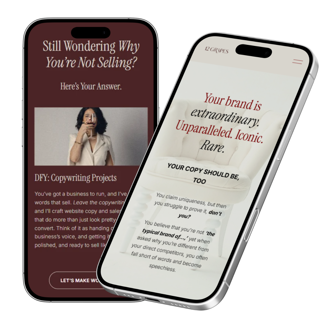
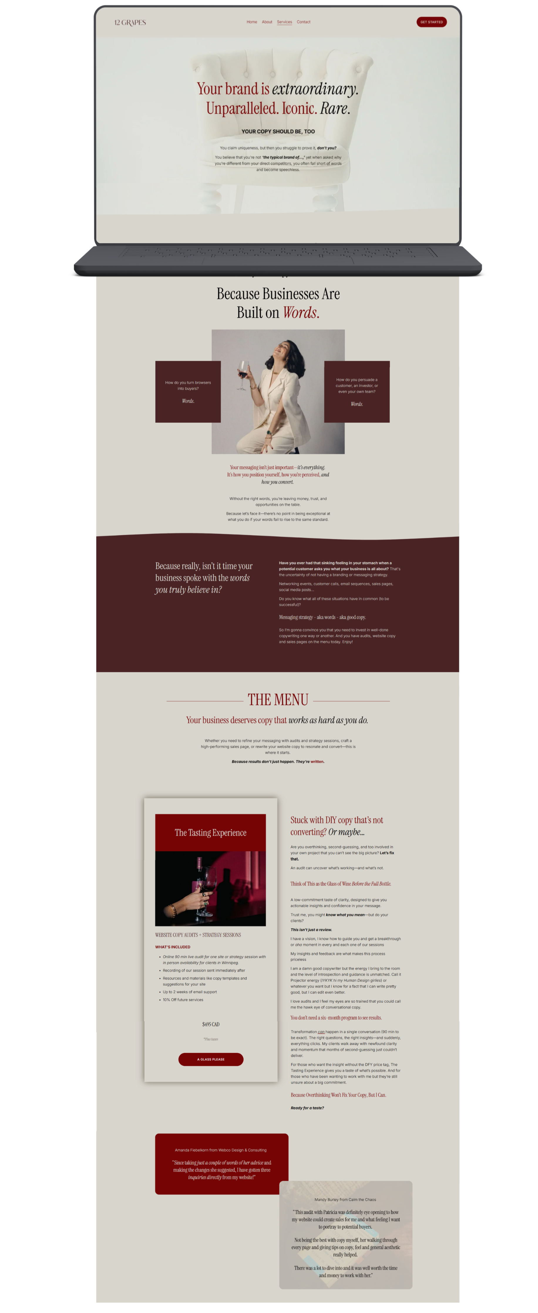
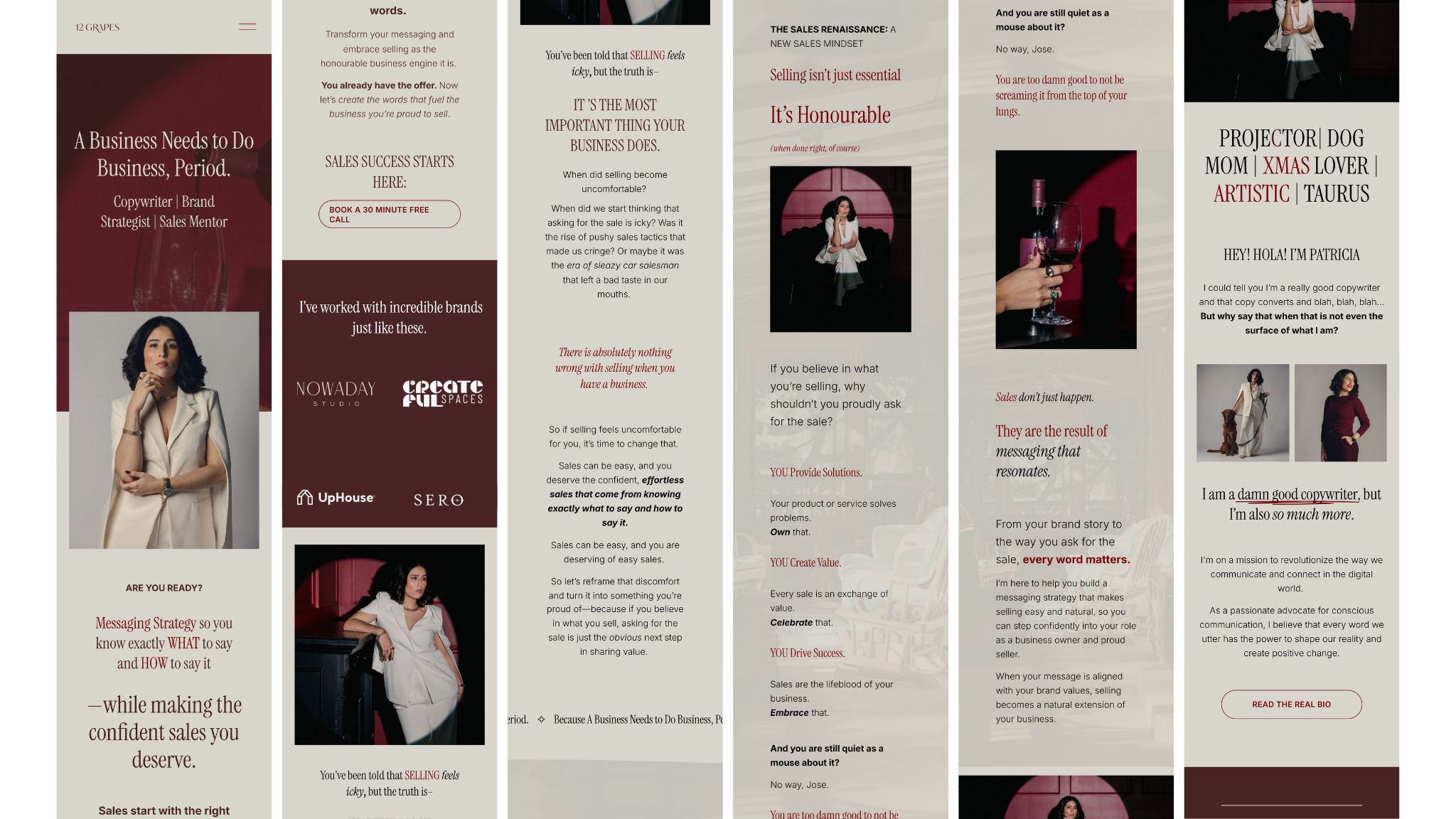
The design combines deep wine-red tones, elegant typography, bold imagery, and a restrained visual system to create something sophisticated without feeling predictable.
Subtle motion and interactive elements add energy throughout the experience, giving the site a sense of movement that many competitor websites lacked. The goal wasn't to decorate the copy. It was to give the copy a stage.
-
A website that feels like 12 Grapes.
The new website gave 12 Grapes a digital home that matched the quality and personality of the brand behind it.
It also gave potential clients a clearer understanding of Patricia's services and how she could help them—which translated into better-quality leads and a stronger understanding of what she offers.
Most importantly, the website no longer needed to apologize for having a lot to say. It learned how to say it well.
The Website
section 02
-
Pour it all out. Let it breathe. Find what makes you different.
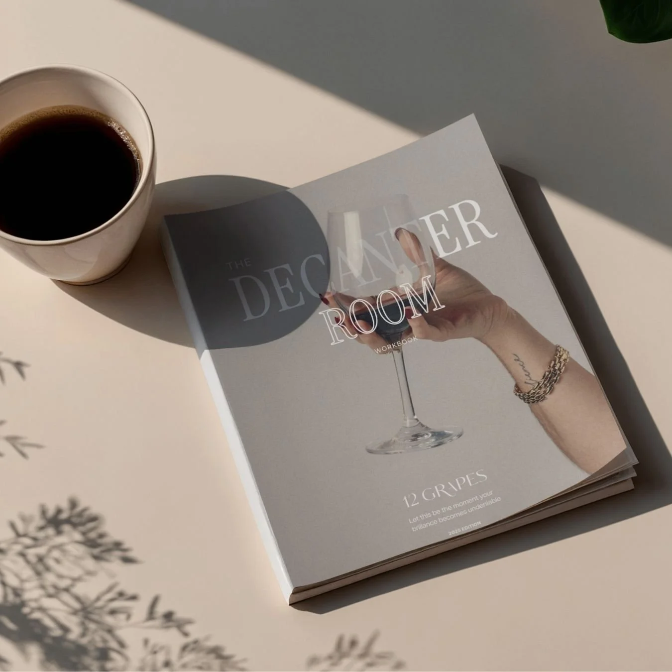
The Decanter Room is an introspective brand strategy workbook created by 12 Grapes to help businesses dissect their brand from the inside out.
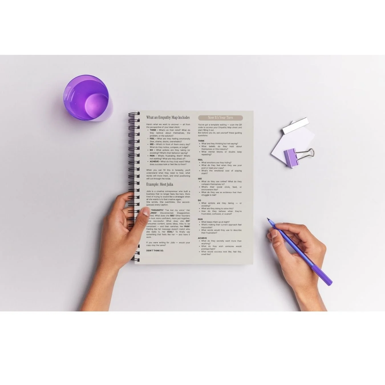
Through a series of guided exercises, clients unpack their positioning, messaging, voice, services, and what makes them different—until they can see their brand with much more clarity.
The name comes from the decanter: a vessel designed to hold wine, separate it from sediment, and give it room to breathe.
The workbook applies the same idea to a brand. Pour everything in. Let it breathe. See what remains.
-
Turning strategy into something people can actually work through.
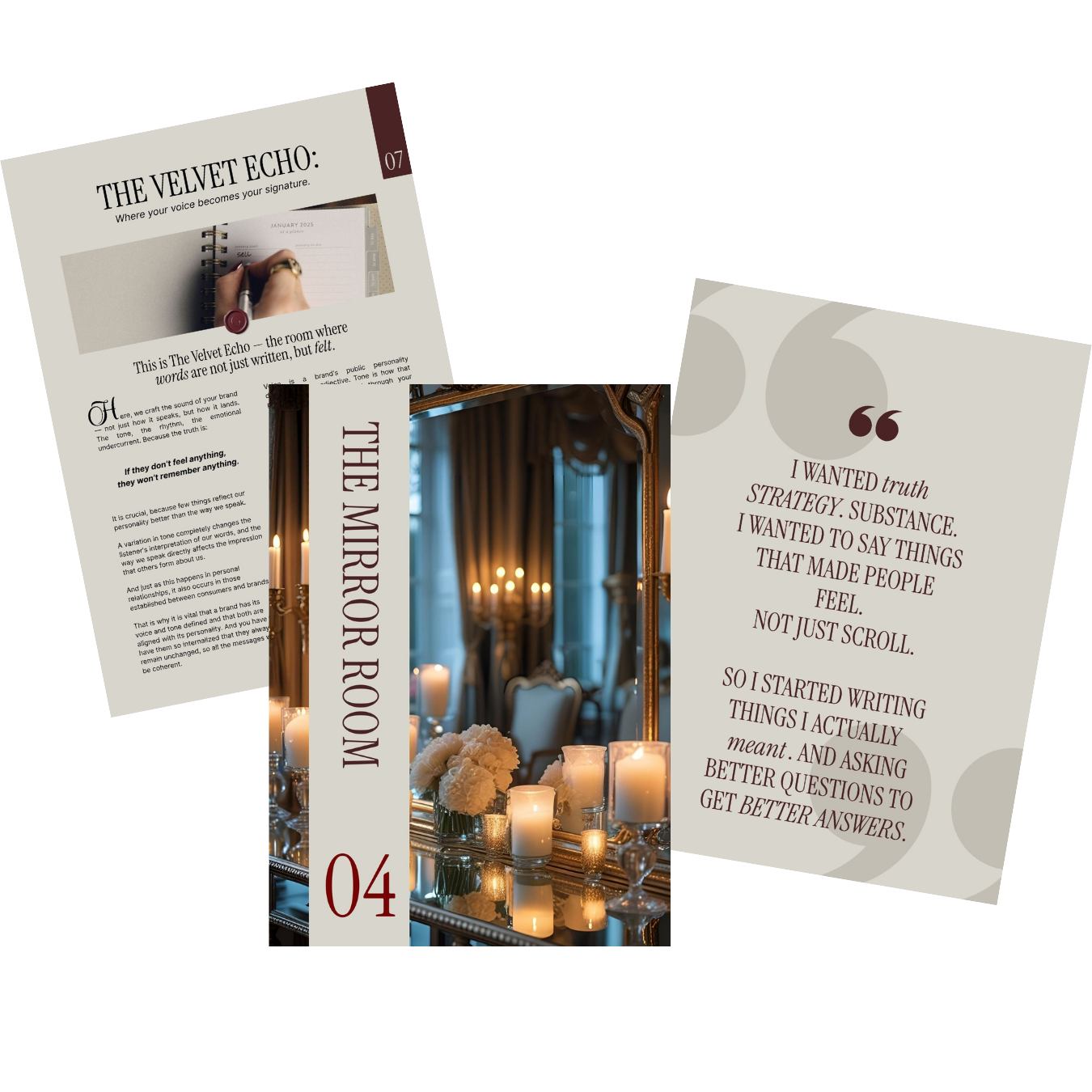
Patricia developed the methodology, content, and structure. I translated it into a visual and interactive system that made the exercises easier to understand, complete, and revisit.
I designed the cover, layouts, visual exercises, writing spaces, illustrations, and supporting graphics, as well as both printable and interactive digital versions.
For the digital workbook, I also created typeable fields so clients could complete the exercises directly on their devices.
Where an exercise felt complex or abstract, I helped simplify the visual presentation so the strategy could become easier to follow.
The goal was to make strategic work feel less intimidating and more immersive.
The visual language carries the same sophisticated, wine-inspired identity as 12 Grapes, while the layouts create enough space for clients to stop, think, write, and explore.
And the workbook doesn't end with a download.
Once clients have poured everything onto the page, 12 Grapes can step in to help them make sense of it—through a discovery call, one-on-one support, or a deeper branding engagement.
The workbook is designed as an entry point into the larger 12 Grapes experience.
The Decanter Room
Desktop version
Responsive mobile version
The real challenge wasn't fitting the content on the page. It was making people want to read it.
This project challenged me to think beyond the traditional relationship between copy and design.
When the words are already this strong, the designer's job isn't to compete for attention. It's to create the conditions for those words to be understood.
From the website to The Decanter Room, the goal was the same:
Take a strategic idea and turn it into an experience people can actually engage with.
“A strong brand deserves more than a beautiful website. It deserves an experience that feels like it.”